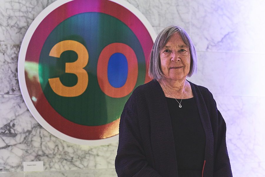
With a career spanning over six decades, British graphic designer Margaret Calvert has helped shape the visual identity of the United Kingdom. Her work has defined roads, rail stations, and airports, and her work has given clear directions to locals and visitors alike since the 1960s.
In October, the Design Museum in Kensington, West London launched an exhibition to celebrate Calvert’s incredible influence on design and designers and her continuing impact through projects such as the new Rail Alphabet 2 typeface for Network Rail, designed in collaboration with typographer Henrik Kubel.
The exhibition will show how typography and wayfinding systems are designed. Starting with initial drawings and proposals, to familiar finished pictograms and transport signs, visitors are guided through the display with commentary from Calvert herself.
Born in South Africa, Calvert moved to England in 1950, where she studied at St Paul’s Girls’ School and the Chelsea College of Art. Her tutor, Jock Kinneir, asked her to help him design the signs for Gatwick Airport and they chose the black on yellow scheme for the signs after researching the most effective combination. They also designed luggage labels for P & O Lines in 1957.
In 1957, Kinneir was appointed head of signs for Britain’s roads and he hired Calvert to redesign the road sign system. She came up with simple, easy-to-understand pictograms, including the signs for ‘men at work’ (a man digging), ‘farm animals’ (based on a cow named Patience that lived on a farm near to where she grew up), and ‘schoolchildren nearby’ (a girl leading a boy by the hand), using the European protocol of triangular signs for warnings and circles for mandatory restrictions.
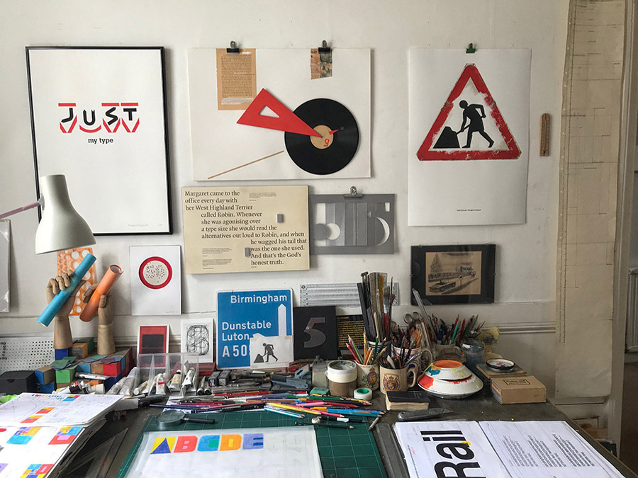
The Design Museum exhibition features hand-drawn materials; insights into early projects that shaped her design process, including her first commission, and the original British Rail corporate identity manuals.
Visitors will get to know Calvert through three timeless typefaces: Rail Alphabet, designed by her in the 60s and used in train stations and on an array of railway related material; Calvert, her iconic face used for the Tyne & Wear Metro and the identity for the Royal College of Art; and Transport, for the UK road signs which, despite minor modifications, are still in use today. New Transport, a commercial face, was designed at a much later stage with Kubel. It is now the official face for the Gov.UK website.
“Margaret Calvert showed Britain the way into the modern world,” said Deyan Sudjic, Director Emeritus of the Design Museum. “Her brilliant signage system made sense of the new motorways in the 1960s, welcomed us into a generation of new NHS Hospitals, and guided us through brand new airports and railway stations.”
Wayfinding as a design field explores how new systems are designed to create a safer and more inclusive travel environment. The next time you’re looking for directions in the UK, remember that behind that directional sign is a woman showing the way.