Effectively communicating climate change is an enormous challenge, especially as there is a need to reach broad audiences across the planet.
In 2016, an animated spiral graphic showing the familiar rise of global temperatures in an unfamiliar way was published on Twitter and subsequently went viral. The original tweet has been viewed more than 3.7 million times, but the reach is substantially larger when considering other media channels. For example, the animation was viewed several million times on various Facebook pages and through many online stories. Prominent people known to have used or shared the graphic include Elon Musk, Bernie Sanders, the artist Banksy, and senior policymakers in the United Kingdom and Australia. It was even shortlisted for a design award and translated into several different languages by the U.S. Department of State for its online web pages.
The most high-profile appearance of the visualization was during the opening ceremony of the 2016 Rio Olympics, which included a section about climate change — probably the most-watched broadcast about the climate ever. The animated climate spiral emphasized how global temperatures have already increased and was viewed by more than a billion people, many of whom may not have been previously exposed to climate science so directly. In addition, the story highlights the power of creativity, social media, open data, sharing of ideas, and collaboration between scientists who never met in person until two years later.
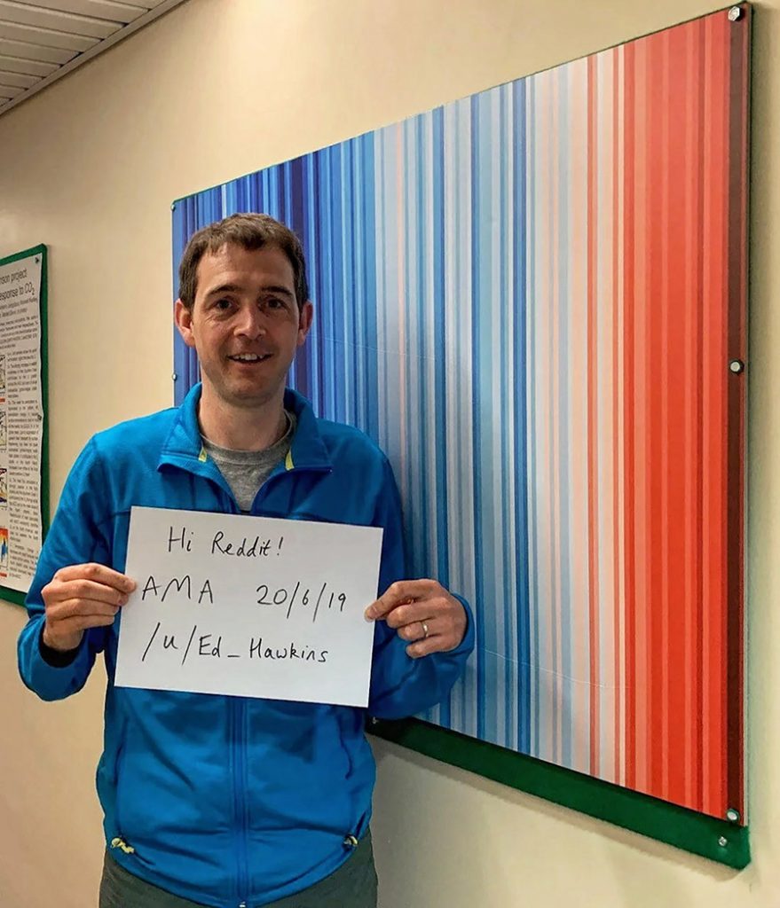
The original idea for creating a spiral graphic came when Jan Fuglestvedt showed Taren Faehn some earlier graphics produced by Ed Hawkins, which had used stacked horizontal lines to represent global temperatures from January to December each year since 1850. Hawkins suggested that connecting December to the following January to create a spiral would show the evolution of temperatures in a more dynamic way. Fuglestvedt thought this was a great idea and sent an email to Hawkins, whom he had never met, including the phrase “this is just a (crazy) thought.” Hawkins found this hard to ignore and further developed the idea and produced the graphic.
Effective communication about how and why our climate is changing is challenging. The primary culprit — carbon dioxide — is invisible, and the worst effects can appear remote in both space and time. As climate researchers, we have access to bewildering amounts of data, but how do we best distill this complex information to make the risks of climate change easily understandable to the public? Susanne C. Moser, a senior research fellow at the Aspen Global Change Institute, has highlighted the important role of the messenger, imagery, emotion, consistent messaging, and keeping the audience’s attention.
In hindsight, many of the design and communication aspects of the spiral resonate with the factors emphasized by Moser. First, the choice to use temperature — a variable that the public is very familiar with — makes it feel instantly relevant and understandable. In addition, the graphic was produced by scientists, who tend to be trusted messengers. Notably, the visualization does not look like a traditional boring scientific graph or require any complex interpretation; it is intuitive and eye-catching. Our impression is that the similarity with a clock — something that is usually regular and predictable but that gradually changes to be irregular — is compelling imagery for communicating the temperature changes.
The animated nature of the graphic is fundamental: It tells a story to the viewer about how temperatures are changing. The animation is not too long, ensuring attention is maintained, and as the temperatures rise substantially, it influences emotions by providing a visual surprise at the end. Many viewers reported watching the animation over and over again for these reasons.
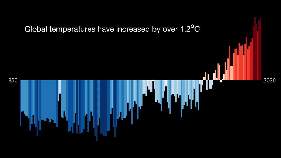
The year counter was placed in the center of the graphic to ensure visibility, and the colors were chosen to aid interpretation and add to the message. The internationally adopted temperature limits are shown in red, which emotionally signifies “danger.” The spiral starts using dark blue and ends with yellow to emphasize that we have not yet reached dangerous levels. Although it may be tempting to use the analogy that temperatures are “spiraling out of control,” as some media stories did, an alternative (and more positive) message is that decision-makers and society can still take control and choose to avoid danger.
But even well-designed and compelling visualizations may not be widely seen or shared. Social media provides a new way of enabling many-to-many communication and is an effective tool for raising the profile of climate science. In particular, Twitter is now actively used by several thousand climate scientists to discuss, engage, collaborate, and communicate, thus raising their profile among peers and the public. Importantly, such online platforms allow a story to be consumed within the social media bubble rather than requiring a journey to another website and provide a relatively easy way of presenting information that can be subsequently amplified by journalists, the media, and highly popular social media accounts.
These factors facilitated the spiral’s spread to over a billion people. In addition, the timing of the publication was favorable, though perhaps fortuitous. It came a few months after the 1.5°C target had been adopted as part of the Paris Agreement and during a significant El Niño event that pushed global temperatures slightly higher in 2016.
We believe that the reason why the spiral went viral is the combination of a creative idea, collaboration, design, timing, and, importantly, openness and possibility for sharing on social media, both within and beyond the research community. This has facilitated the diffusion of the spiral in various forms, and its message is communicated at various forums and to diverse stakeholders. The spiral has stimulated collaborations, and its success has helped inspire other climate scientists to produce a range of visualizations of climatic changes, which have also been widely shared. These are all examples of how unrestricted sharing of data and creative ideas are beneficial. We are delighted that our small contribution has led to a spiraling of creativity, and we encourage others to experiment and continue sharing ideas.